Branding Story: Design for Mutability
March 24, 2020
By: Ben
Antidote recently rebranded, and we decided for a number of reasons to build a logo that was algorithmic. Several of our acquaintances were interested in how that process worked, so I wanted to share a little about our design iterations and thought process. If you're thinking of building branding with a similar process, maybe some of our background will help you.
Branding is seen as a space to flex one's design muscles. Design school spends an inordinate amount of time mythologizing logos and the designers behind them. It's a small amount of design real estate with a big impact. When building a new branding, especially for something as personal as your own company, there's a lot of pressure to get it right.
Antidote started as a design company building games for non profits. Over the 7 years since our inception, we have broadened our mission to help explain the complexity of our planet using playful methods. Through our many field projects, designs, and workshops, we now have a process that uses the systemic aspects of game design combined with human centered design processes. We wanted to reflect that change in our work's focus in our new look.
Our branding identity had to speak to our audience, imbue a feeling of play without looking childish, show complexity in our work's relationship to data, and emphasize how our work specifically deals with sustainability and climate change. Our audience is policy makers who deal with big problems while at the UN, Red Cross, or other global NGOs.
We did an informal audit of branding trends. This can be misleading, because brands from large corporations, even design studios, are kinda boring. If you look at the logos for the largest companies in the world, their logos are often only the company name in a custom sans serif font. We're small, but we work with staggeringly large organizations. So our branding has to fit in with what are clients are expecting while still resonating with our company's values.
So our aesthetic approach had to balance the often restrained aesthetics of non profits with complexity and play. This was going to be difficult, so we started sketching. We also hadn't decided at this point to create an algorithmic logo, just a standard Illustrator logo.
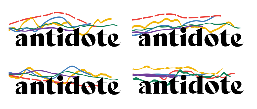
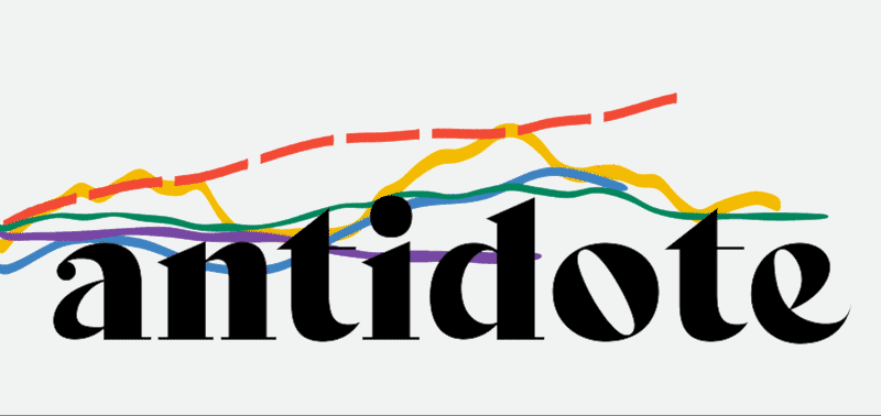
Through several iterations, we came up with invoking the idea of a landscape in our logo. So much of our work dealt with in environmental systems modeling, transportation networks, and climate change, so that approach fit into where we specialize. We then put it in context on a test version of our new website's design, and casually showed it to designers on our phones. Most folks' first impression of us would be through a small screen, and if you hand someone your phone who's sensitive to design, they can't help but have an honest reaction.
The overwhelming reaction was "Is that a snake?" We had some work to do.
There's an analogous connection between mountains and bar graphs. They can overlap, have peaks and valleys, and come in all sorts of colors. We sketched out some more ideas with the logo but broke the top swoosh into many smaller pieces. It was working better, but doing it by hand was time consuming, and getting it to look "natural" was difficult. That's when we decided to go algorithmic.
Algorithmic logos are logo forms that are generated in collaboration with a computer program. The weather-mediated identity of Nordkyn is an excellent example. I've been low-key fascinated with algorithmic logos since Sagmeister's 2007 rebranding of Casa di Musica. To me, the best algorithmic logos embody the ethos of an organization while maintaining a human touch to them. MIT's logo was first done by E Roon Kang and The Green Eyl had a more human element to it than Pentagrams rehash of it a few years later, but works because of the media lab's computer centrism.
Branding will continue to shift into algorithmically generated spaces in the future, as folks from Pentagram to Jessica Walsh are creating dynamic logos, if not bespoke software for logo generation. The shift into asking a computer to assist in creating one's branding makes sense. What is branding if not a set of rules to maintain a consistent visual message for a corporation across different mediums? Computers are great at rules, so why not replace branding books with a piece of software? If the software is built well, a person can simply generate a logo fit to whatever task is at hand, and their level of interest would determine how creative the use of the brand is while still adhering to brand guidelines.
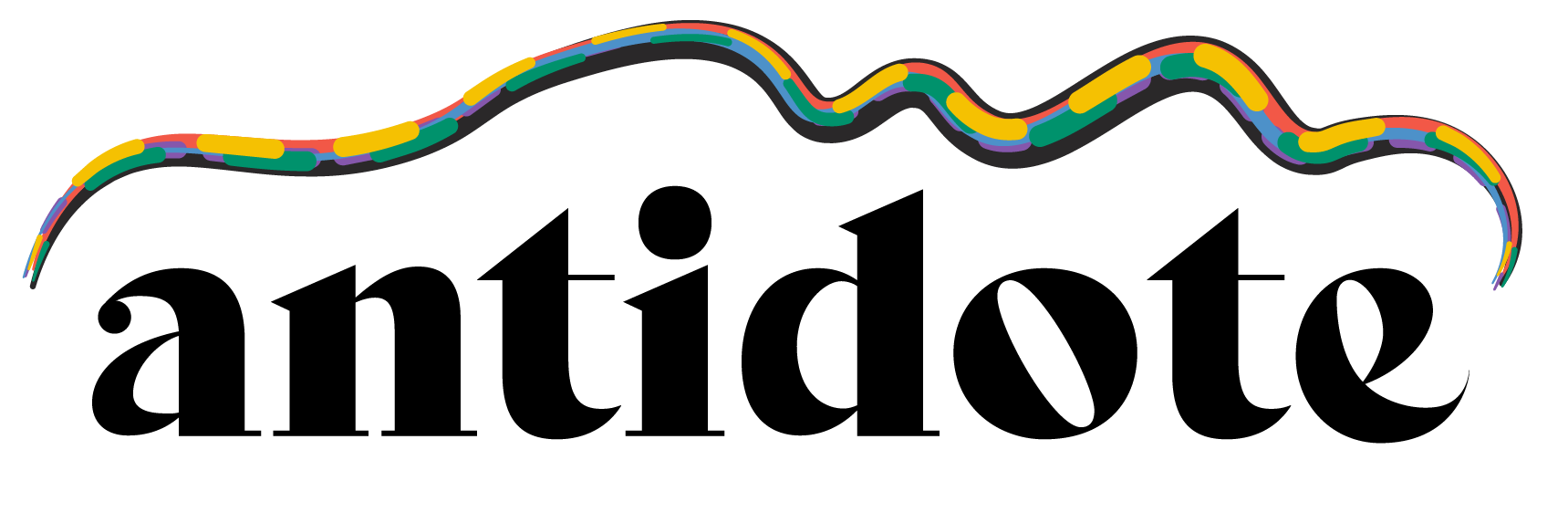
Using Processing, I programmed software to generate logos that would incorporate our colors into five stripes of varying length, width, and even gaps. The typeform of our name holds it together, and logos are generated in SVG format so they can be scaled to any size after export. It's not the easiest program to use, but everyone at Antidote can program a little, so it works for our needs. As we grow, we will build out a front-end interface for our branding software to allow folks who don't have programming knowledge to use it.
We're quite excited about our new look, and are finding new places to incorporate it in our work. Take a look at the code behind the logo, and let us know what you think!