Drawing Covid
May 11, 2020
By: Mohini
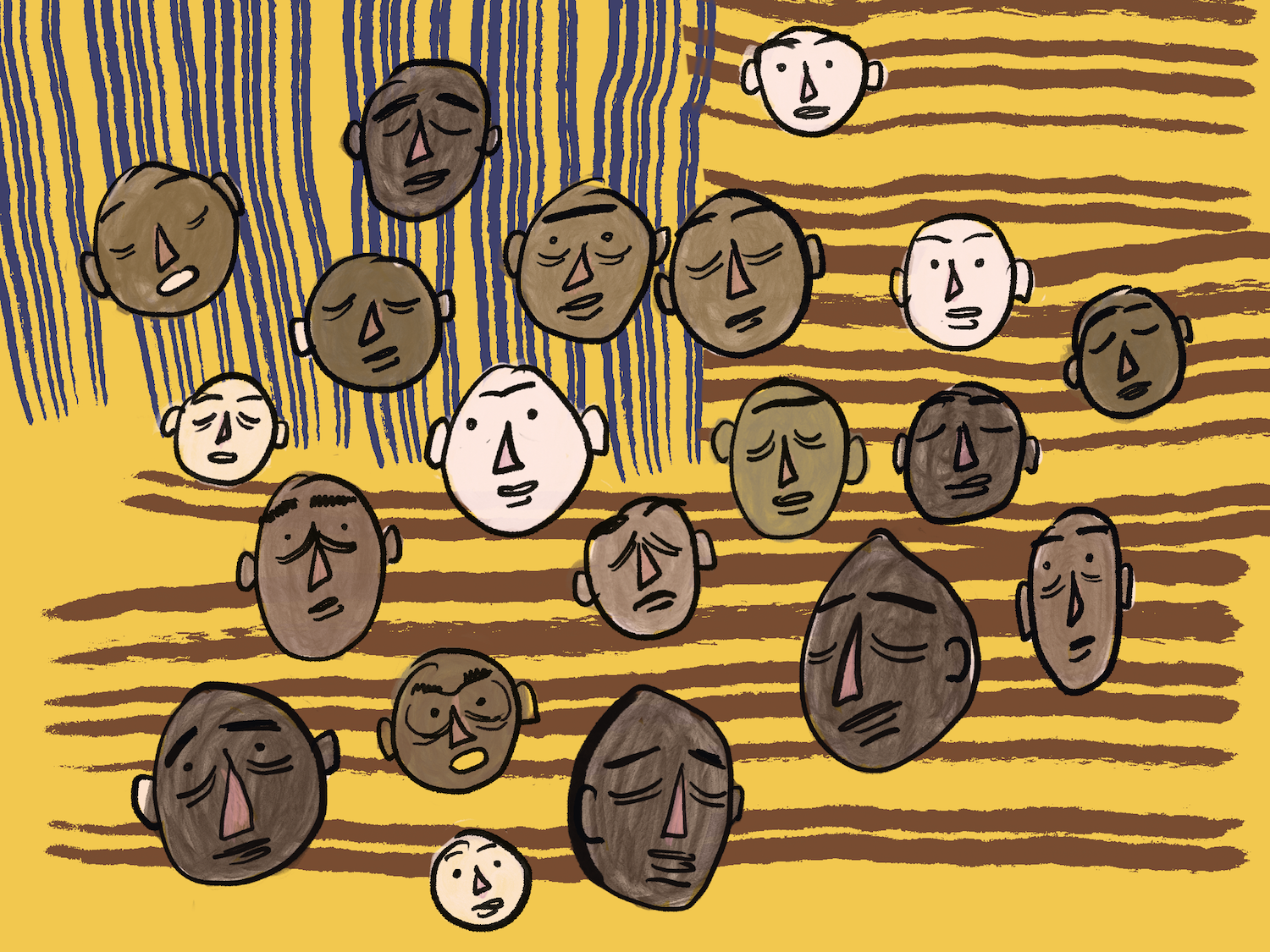
How do you Illustrate a Pandemic?
It's an unhealthy coping mechanism, but I cope by working. Over the last few weeks, I decided to volunteer with the COVID Tracking Project, as a way to feel less hopeless and out of control in these strange times.
The COVID Tracking Project (CTP) is a volunteer organization dedicated to collecting and publishing the data required to understand the COVID-19 outbreak in the United States. Started by journalists at the Atlantic looking for credible data sources to keep track of this unprecedented pandemic, CTP is a space I can apply years of UX, product design, and illustration skills towards accurately remembering, if not solving this pandemic.
I jumped into the new website redesign project, and wanted to try my hand at illustrating something for them. I was asked to make an illustration that would express the diversity of impact along racial lines due to COVID, to tie into the new COVID Racial Data Tracker collaboration with the Antiracist Research & Policy Center. However, given the nature of the project the illustration had to be minimal, but evocative, avoiding gruesome realism without looking away from the uncomfortable facts of this pandemic.
There are many valid approaches to this sort of design brief, but given a short turn around, my relative new-ness to the project, and the high impact of this piece, I decided to use some constraints to ground myself. I wanted to try a bunch of stylistic and conceptual approaches, share them fast, with the option to iterate on the fly, and center the whole piece along systematic racism at it's core theme. As new data by the CDC shows us, the impact of COVID-19 on people of color has been exponentially higher than on white identifying Americans. This, along with CTP's new collaboration with the Antiracist Research & Policy Center, make racial diversity a good core tenet to focus on. Initial input from the CTP team was to keep it minimal, use textures to highlight elements, and have simplified human-like characters in it.
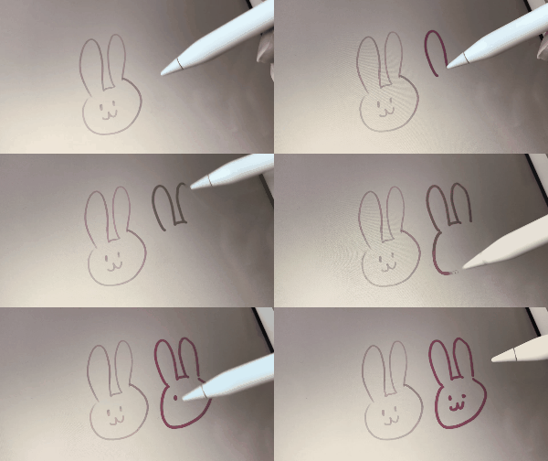
Keeping the various constraints in mind - speed, variety, iterative potential, I decided to experiment in a relatively workflow for me, using Procreate on the iPad pro with the apple pencil.
I doodled on my iPad in the past but hadn't really set up a good workflow.
I started out with sketching some quick ideas on expressing the breakdown of American society during covid 19. Themes that kept reoccurring were elements of the flag juxtaposed with alienation and voids. Things falling apart.
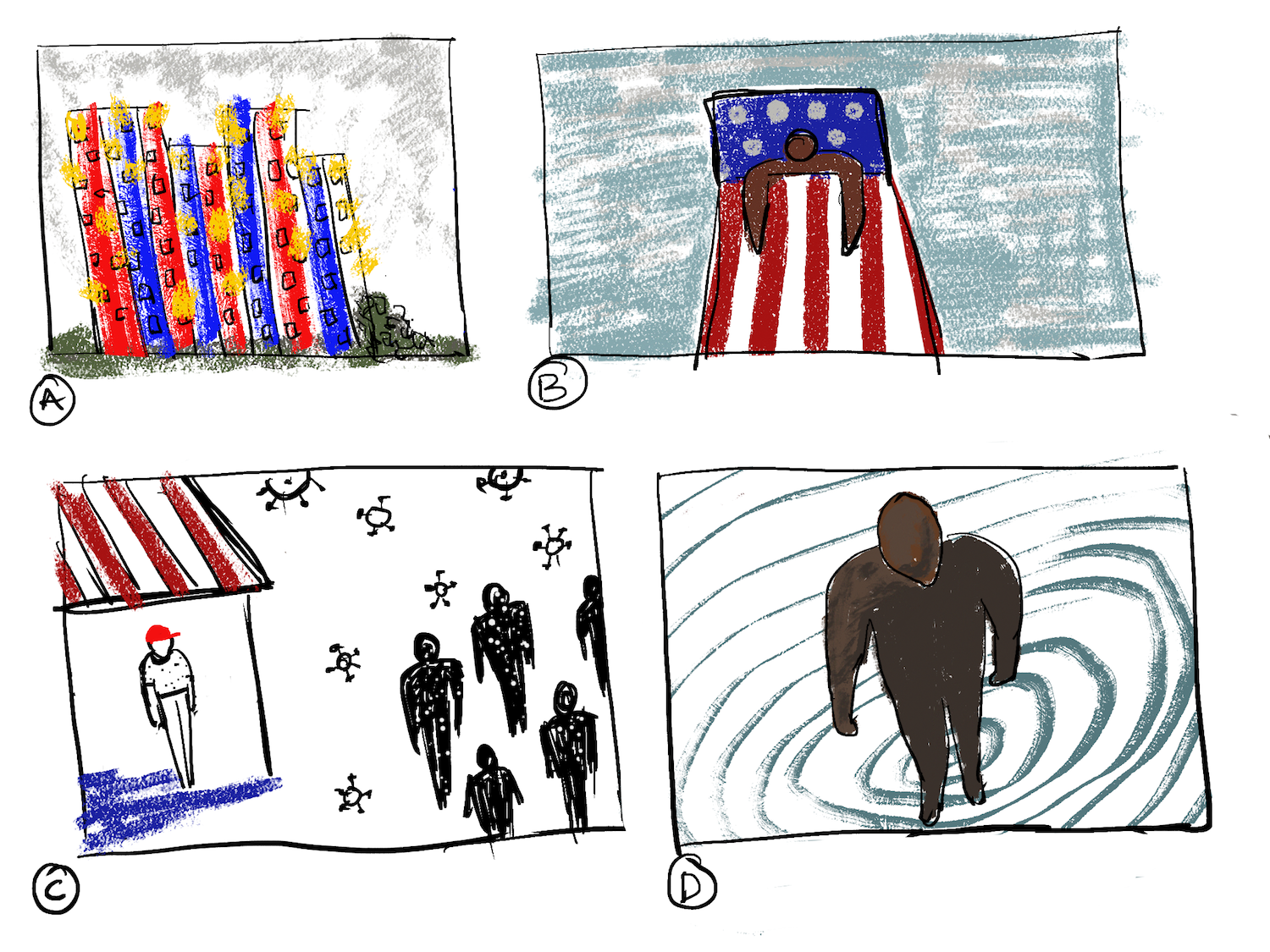
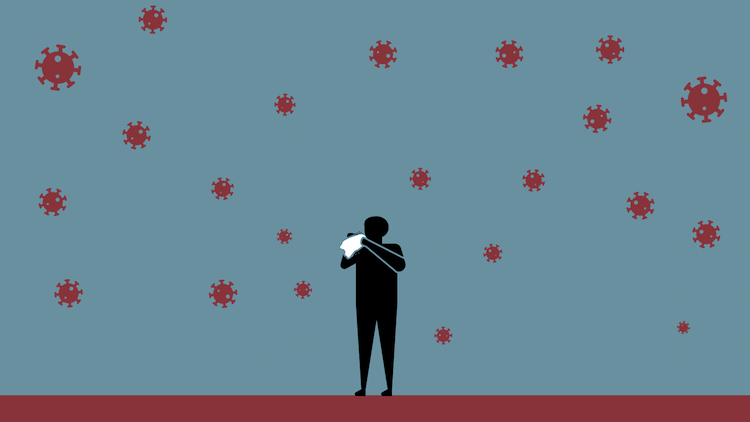
I wasn't very happy with these sketches, so I shifted back to my familiar tools on desktop with a quick illustrator sketch. This felt too clean, too neat and tidy. It didn't have the emotional resonance that this pandemic demands. If anything, Covid-19 is the antithesis of control.
I liked the speed of drawing directly on my iPad. Using the apple pencil on it mimicked my doodling habits, which opened up possibilities and risks I usually avoid. The adobe suit tools on the ipad are just too controlled, and Procreate felt wild and erratic. Usually chaos is something I avoid when working on a brief, but it felt fitting here. Instead of being strategic, I just started sketching and sharing whatever I made with my colleague at CTP.
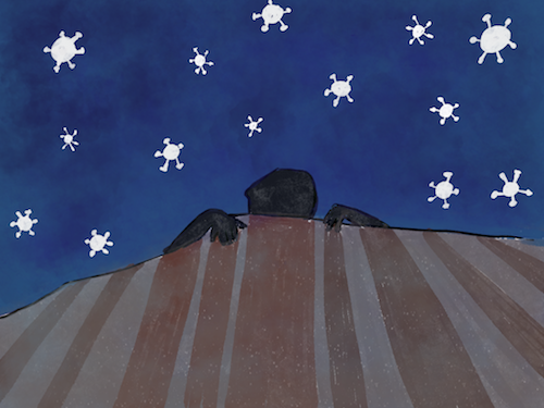
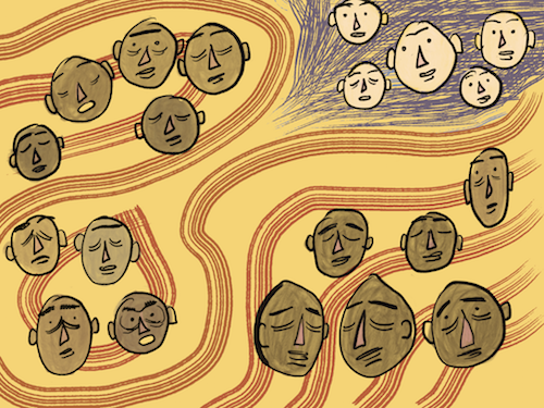
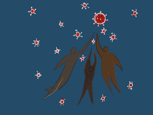
We all naturally gravitated towards stripes, and faces, and decided to narrow down on that concept some more. We wanted to incorporate the flag in a more minimal, metaphorical manner, but wanted to focus to be centered on the person.
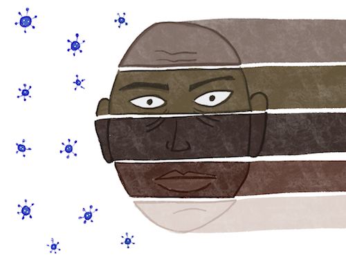
I liked the idea of replacing the stars in the flag with the coronavirus, but it just didn't work well. We all liked the face split in stripes much better, and wanted to isolate that from the larger flag metaphor.
The face is minimal but stark. The skin tones show a range of tones with a focus on darker skin tones, and the simple structure of the face allows it to be many things at once. However, it felt too balanced and even.
We began iterating together on Slack, to get input from the rest of the team and still make the deadline. I tried skewing the stripes of the faces, tilting them on a slight angle so they looked like they almost fit together. The offset without the stripes felt a bit too forced, and the full length stripes warped the image too strongly. But all in all this direction showed more potential.
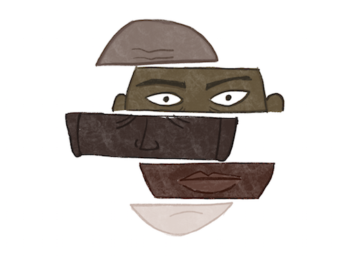
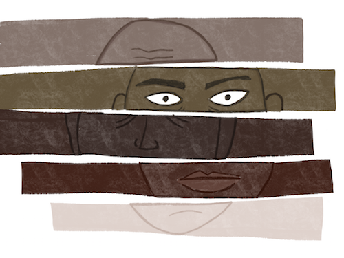
We decided to experiment with darker backgrounds and the internal color palettes being used in other parts of the website.

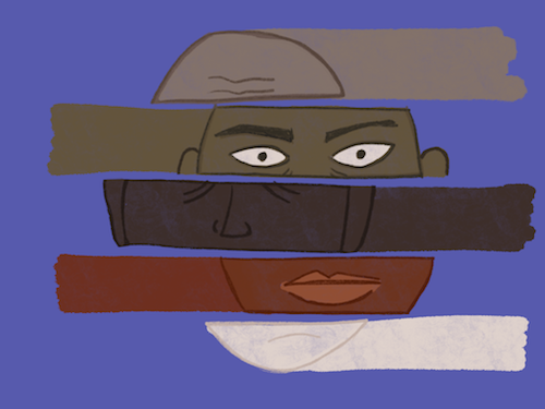
The darker background reduced the contrast with the skin tones, and the rust-brown color palette that the project had been using so far didn't realistically express the breadth of racial tonality for me. This led to a healthy conversation about the balance between realism and farce, and exposed a blind spot in the palettes being used so far. In the end we decided to compromise, using one color from the team's color palette for the mouth stripe, and using a pale lavender from their brand palette for the background, to maintain cohesion.
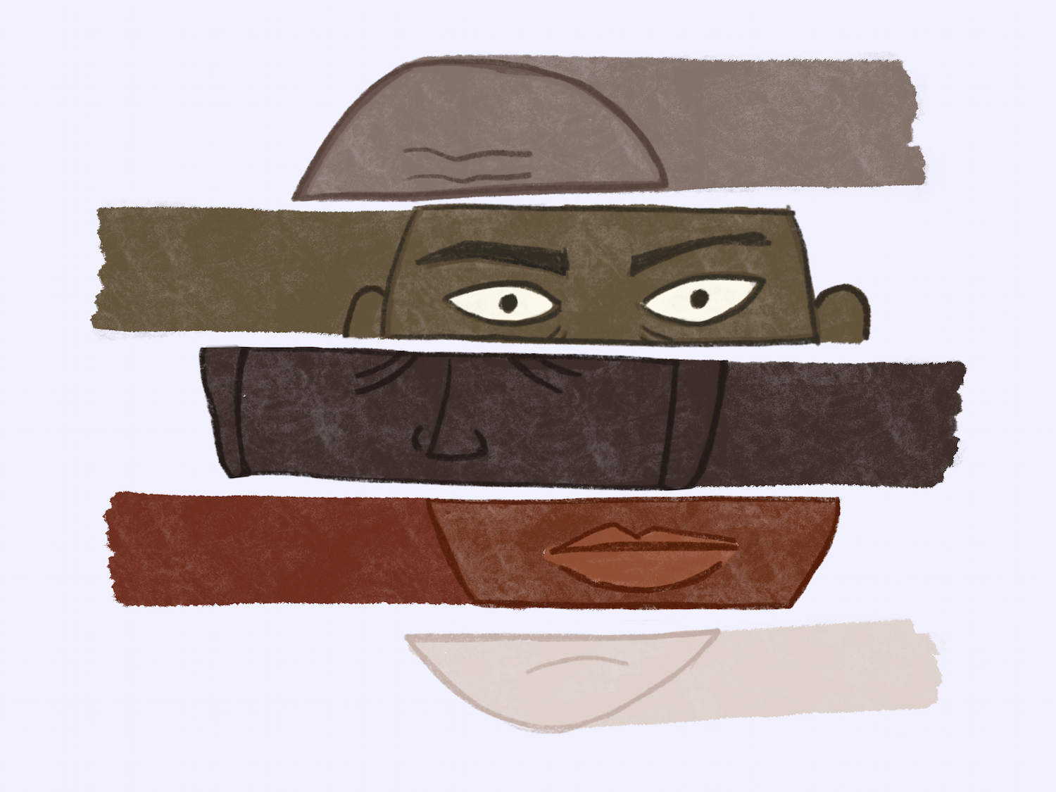
The final result was something we all felt good about, and was a true collaboration. I enjoyed using the iPad, and will try and incorporate it more often into my projects. While I hadn't meant to finish this illustration on the ipad, I was surprised to see the fidelity the tools provided. Along with layer support, exports as .psd, and a mix of vector and non vector tools at hand, this is an exciting new avenue for quick turn around visual work.
